November 24, 2021

Work – White Finch Bakery

The White Finch Bakery. Photo courtesy of @Dustylensuk

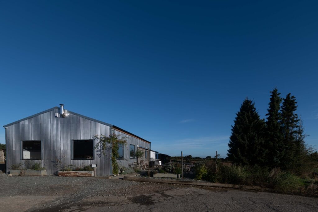
Set in the middle of the popular Broomfield P.Y.O. Farm in the village of Meopham, Kent, the White Finch Bakery was an established presence on the local weekend brunch scene.

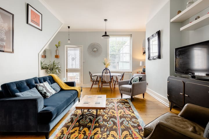
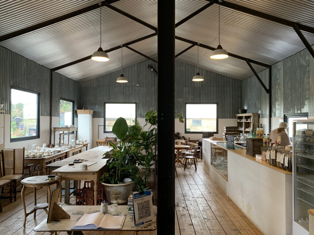
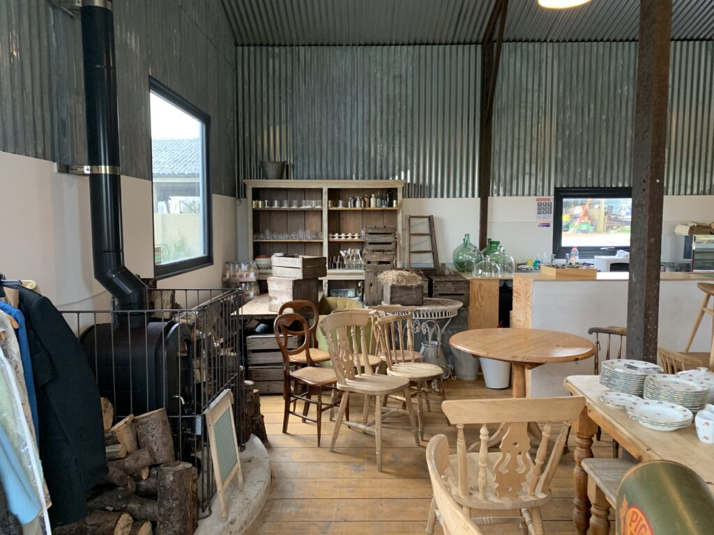
It's original permutation hewed towards the countryside, tastefully curated decor one might expect from a cafe in the Garden of England - mismatched bric-a-brac, reclaimed farmhouse furniture, rough finished pine flooring. By the time the owner and head baker Pippa Brown contacted me she had already decided this was no longer what she wanted or what she needed to push the business forward.

Dining area and baking area in it's previous form.
Dining area prior to clear out.

As an aside, if there is something positive to come out of the past series of Lockdowns it has to be business' like the White Finch taking the opportunity to reinvent themselves. Only with a forced closure could we have accomplished the entire redesign you will see here without having to voluntary shut down for three weeks.

Jpeg of concept 3D model of the new White Finch.
Work begins towards realisation of new, larger baking area.
Coffee counter begins to take shape.

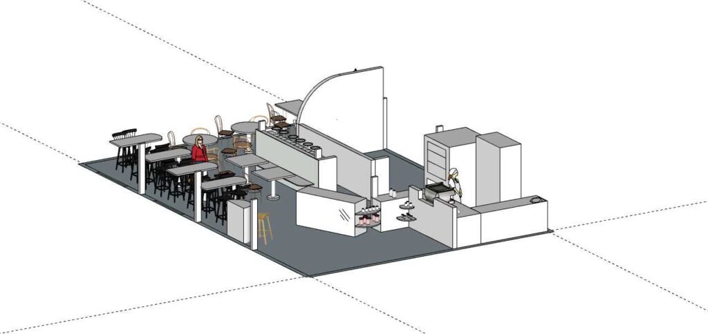
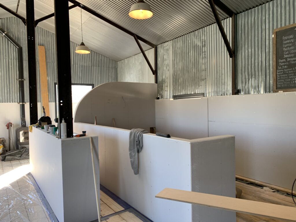
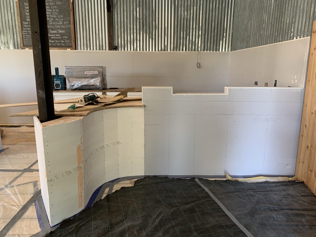
What Pippa wanted, and what she ended up with, was a more simplified, streamlined, consistent look with floorplan that allowed for more seating while at the same time opening the space up for serving staff as well as patrons. We also doubled the size of her baking area as well as creating an actual takeaway area that Pippa developed over the intermittent breaks between lockdowns.

New dining space and large working bakery. Photo courtesy of @Dustylensuk

Coffee counter with beautiful custom counter. Photo courtesy of @Dustylensuk
Large, view filled windows now integrated into dining space. Photo courtesy @Dustylensuk

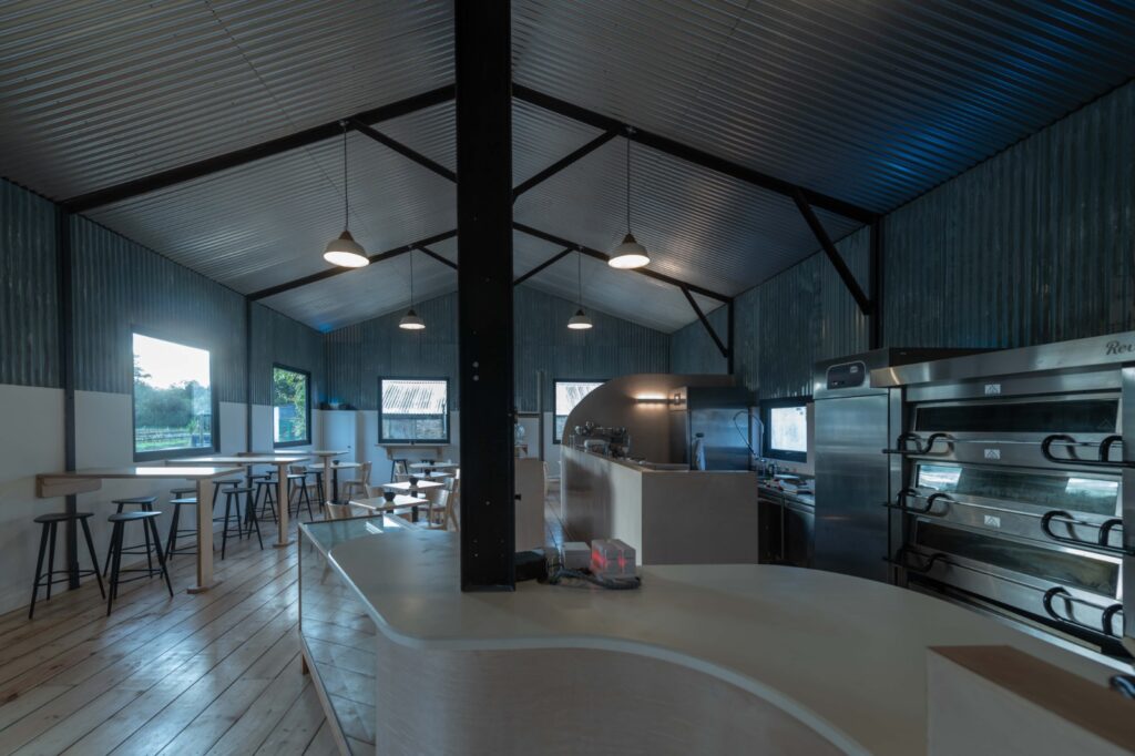
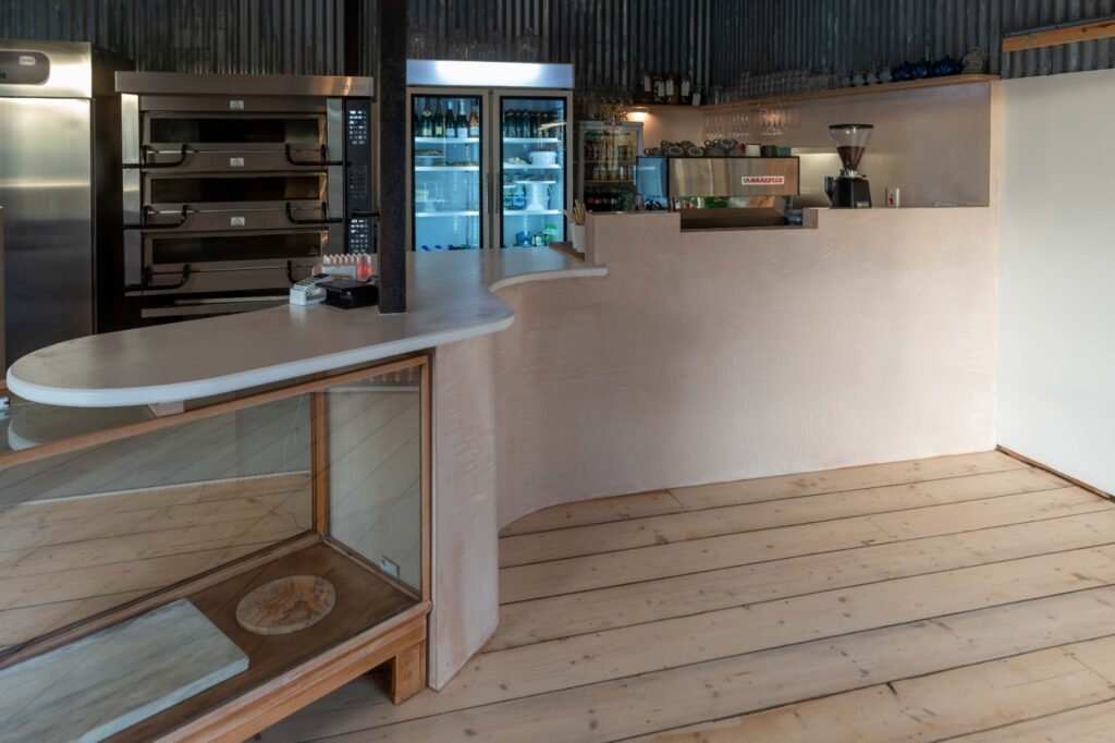
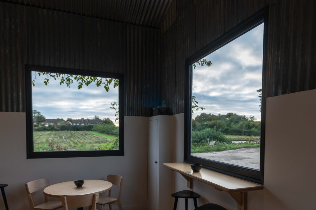
Most of the discussions in the early stages of my design process focus on what the space needs to do and what you want it to be. Only after we know what the space is can we decide what it is going to look like. In this case Pippa wanted to have more seating and still maintain space around table so that it didn't feel crowded. This need led us towards simple shapes and furniture, removing unnecessary objects and using unused wall space to introduce new seating areas. We also wanted it to feel new and open and contemporary. This led us towards a simple, neutral palette with light birch tables and chairs.

Ultimately, an interior designer is there to make the client happy. To listen to them and find out what they want and guide them towards the solution. The White Finch bakery is an example of creative problem solving with a strong sense of aesthetics and function and when it comes to a small business in particular this is exactly what you need from a designer.

September 13, 2021

Work – East London Sitting Room

After an extended hiatus in short term letting my clients wanted to reinvigorate the sitting room in their East London pied a terre which they also list on Airbnb.

As it is both a second home and a short let property it was quite tricky to find the balance between the two. we decided to treat it not as a second home but as a place my clients would like to would like to visit if they were travelling. We livened up the space with a vibrant Ikat rug and a blue smart velvet Mistral sofa from Heals. We went very local to find a unique media console from East London manufacturers Unto This Last and added a bit of English tradition with vintage Ercol stickback chairs.

August 2, 2021

Artwork as an element in design

Original artwork plays a large role in my approach to interior design. Not only does the piece have its own presence and for lack of a better word - personality - but it also represents the taste and sensibility of the client. This can also be accomplished with furniture choices (and I consider this as well) but often furniture, by it's utilitarian nature, doesn't make as bold a statement as quickly as a quality piece of art. I have recently completed a sitting room in Harvel that has 5 original pieces in it. I thought I would link a lookbook featured on Dezeen.com that helps to illustrate the importance of strong artwork in a home.

July 14, 2021

Colour Inspiration

My client in Deal (who I've discussed before in the post titled Underwater World) wanted blue and green in her master bedroom. After a bit more discussion we came to the conclusion it wasn't Yves Klein Blue and Emerald she was after but a pairing far more mellow. I went away and a few days later I was again at the seaside, my two sons throwing stones into the incoming tide and the weather began to change. Clear blue sky and steel grey water became the colours you see in the photo below. These were the colours I needed to present to my client. How? I found an online colour picker that would give me the RGB values which would allow me to identify commercial paints that most closely matched what I had captured on my phone. In practice it worked out beautifully. We added a chair rail which had the effect of adding a horizon line and went blue above and green on and below the rail. The client was pleased because the colours were in keeping with the seaside location of my her summer home and created a serene yet dramatic atmosphere to her bedroom.

Benjamin Moore Secret Path

Benjamin Moore Blue Dusk

July 12, 2021

Work – Thresholds

Entrance to Sitting Room, Harvel.

Strictly speaking, in a home the threshold is a strip of wood, or stone, on the floor that you cross as you pass through a door way.

I'm being a bit more generous here and including the door jam.

In period homes you will often have walls that are incredibly thick by today's standards. In this case, over 300mm thick. This presented me with an opportunity add a bit of dynamism to what is typically an ignored element in a room. I decided to use a somewhat random array of lines to keep it from becoming too severe because, as with most homes of this age, perfection and straight lines can be jarring compared with the relative imperfection inherent in the original building materials.

Granted it can seem somewhat controversial to introduce such a forward looking approach to a doorway in a period home but my client loves it. She has her own unique, informed style - we discussed abstract expressionism at our first meeting - and was keen to try something more interesting when the opportunity arose. As you see from the picture, taking an opportunity can pay off beautifully.

July 9, 2021

Work – Sitting Room

I’ve just begun work on the sitting room for a client in Harvel. She found out about me through the local farm shop. I will post progress once we make some.

July 9, 2021

Go Inside a Revitalised Architectural Marvel in Southampton

Interior designers often find inspiration in the architectural style of the properties they are renovating. But in the case of this oceanfront home in Southampton, the architecture was so distinctive that it would have been impossible not to acquiesce to it. “I let the house tell me what it needed,” says Manhattan-based designer Wesley Moon. “There were a lot of really strange details, like windows that lean forward, off-center skylights, and also a play on heights that was really interesting.”

Built in the early 1980s by Norman Jaffe, an architect who achieved renown through a series of sculptural Hamptons residences, the home looks like a jagged companion to the sand dunes surrounding it, and was cleverly named Xanadune. Its walls are made of cut boulders and glass panes, many of them steeply slanted to follow the angle of the monumental shingled roof. Its owners, a couple with four grown kids, wanted to update the home and create an easeful atmosphere reflecting the colors of the seaside landscape. “We bought the house because we fell in love with Jaffe’s architecture,” says the husband. “The interior combines multiple levels with a wide array of geometric shapes throughout. The living room is dramatic with its soaring ceiling, while the lower bedrooms are cozy and inviting.”

In the sunken living room, which is part of a vast open space with ceilings that rise up to 30 feet, Moon created a set of side-by-side parlors. “It’s a very angular house, and I felt it needed a softer edge,” says the designer about the soothing color palette, largely inspired by the surrounding seascape. Right next to the fireplace, he placed two oyster-hued loveseats with wraparound ebonized legs. The Jean de Merry coffee table between them has bronze legs and a shagreen leather top. In the foreground we see a curvaceous armchair by Georgis & Mirgorodsky for Maison Gerard.

The colors of the sand and seashells on the beach, as well as the stones on the wall, informed the dining room’s decor. Moon designed this cast-resin table with an inset glass top. “I wanted a table that would feel architectural, but not heavy,” he says. “I settled on this amber resin with a smoky effect. It reminded me of the waves washing up on the beach.” The Vladimir Kagan“sculpted sling” chairs were upholstered in an ivory acrylic yarn from Link and a handwoven ikat from Bermingham & Co.

One of the most significant changes Moon made, in addition to renovating the kitchen and bathrooms, was refinishing 12,000 square feet of oak panels that cover many of the walls and ceilings of the home. After a monthslong process that involved stripping, bleaching, wire-brushing, and refinishing the formerly tawny wood with a flaxen stain, the property acquired a breezier and more modern feel. “I wanted a contemporary space, not an ’80s revival,” says the designer. “The house was so contemporary when it was built, I thought I’d continue in that spirit.” 

For Moon, who studied architecture at Georgia Tech and worked at two major interiors studios in New York City before starting his own practice in 2008, choosing the furniture for this unusual dwelling was not as arduous as one might think. “Each space is very unique, so there were not that many options in terms of layout,” he says. “I did have to be careful about making sure the proportions were right.” The master bedroom, for example, isn’t rectangular and has only one uninterrupted wall to place the bed against. But the main living area, an extensive space with ceilings that rise up to 30 feet, offered myriad possibilities. To create a sense of intimacy amid such vast volume, Moon designed cozy side-by-side parlors, taking advantage of a sunken section next to the fireplace. One has a set of oyster-hued loveseats with wraparound wooden legs; the other has a thickly structured pillowed sofa upholstered in nude leather and a velvety sand-hued fabric. 

DKD - I recommend this article. Please read further by clicking here.

July 30, 2020

Work – Underwater World

A recent client’s move from London to the seaside - Shoreditch to Deal - came with a key request. They wisely didn’t want to deny where they were - historic Kent coast - but equally wanted to avoid slipping into a a nostalgic nautical/seaside theme.
Thankfully, they already had a good collection of contemporary art and didn’t have to be persuaded to add to it. In this case though it wouldn’t be paintings but instead decorative art.

Ceramics artist Megan Bogonovich has created a large series of pieces that strongly reference sea life while running it through here very particular and vivid imagination.
Using her work throughout - the client bought three pieces - we were able acknowledge the physical reality of the environment without falling back on tired tropes. More importantly we were able to create visual interest as one travelled through the house and add an element that tied rooms together. All while supporting an imaginative, talented artist. Couldn’t have gone better.

July 28, 2020

Make that 4!

I forgot another easy to care for houseplant. This one needs very little light and adds a gorgeous bit of color.

Ludisia Discolor - Jewel Orchid

July 23, 2020

Three easy to care for houseplants.

Plants can enliven a room. Here are three easy to care for houseplants

Read more